A New Vision for Southside Optical: Creating a Modern, Accessible, and User-Friendly Experience.

01. Introduction
Who is Southside Optical and what makes a redesign essential for it?
Southside Eyecare & Optical clinic has served the local community for years with professional eye care services including consultations, eye exams, eyewear sales, and contact lens fittings. While the clinic has earned trust through quality care and word-of-mouth referrals, its current digital presence no longer reflects the professionalism or warmth of the in-person experience.
Individual Project
8+ Hours
Figma, Figjam, Procreate, Photoshop, ChatGPT, and Slack
UX Research, Qualitative Interviews, Visual Design, Wireframing, Prototyping, User Testing
Team
Duration
Tools
Key Skills
What’s Lacking on the current Design?
Southside Eyecare & Optical's website lags behind local competitors in both design and functionality. While other clinics in Anchorage feature modern, visually engaging, and mobile-responsive websites with user-friendly navigation and online booking, Southside’s site feels outdated, text-heavy, and lacks key features like appointment scheduling and strong service promotion. A redesign that incorporates current UI/UX trends such as high-quality visuals, responsive layouts, and clearer calls to action will significantly improve user experience, better reflect the clinic’s professionalism, and help it stay competitive in the local optometry market.
Solution
With this new look, Southside Optical transforms its online presence into a modern and welcoming platform that reflects the warmth of its in-person care, builds trust, and strengthens patient connections.
02. Research
METHOD
User Interview with current and potential patients to understand how they currently use the website, what frustrates them, and what they expect from a modern healthcare site.
Conducted a Competitive Analysis with local eye clinics across Anchorage, Alaska.

Affinity Mapping


Competitor’s Analysis


See Better, Live Brighter.
A modern, welcoming platform that simplifies booking, showcases services and eyewear, and builds patient trust—helping Southside Optical strengthen connections and grow its community presence.
03. Solution Development
Feature Roadmap

Online Booking Feature
This feature makes it simple for users to schedule appointments online, offering real-time availability and instant confirmations for a smoother, more efficient booking experience.
Modern UI Design
This redesign gives Southside Optical a clean, modern look that reflects professionalism and trust while improving navigation and overall user experience.
Information Architecture and Flows
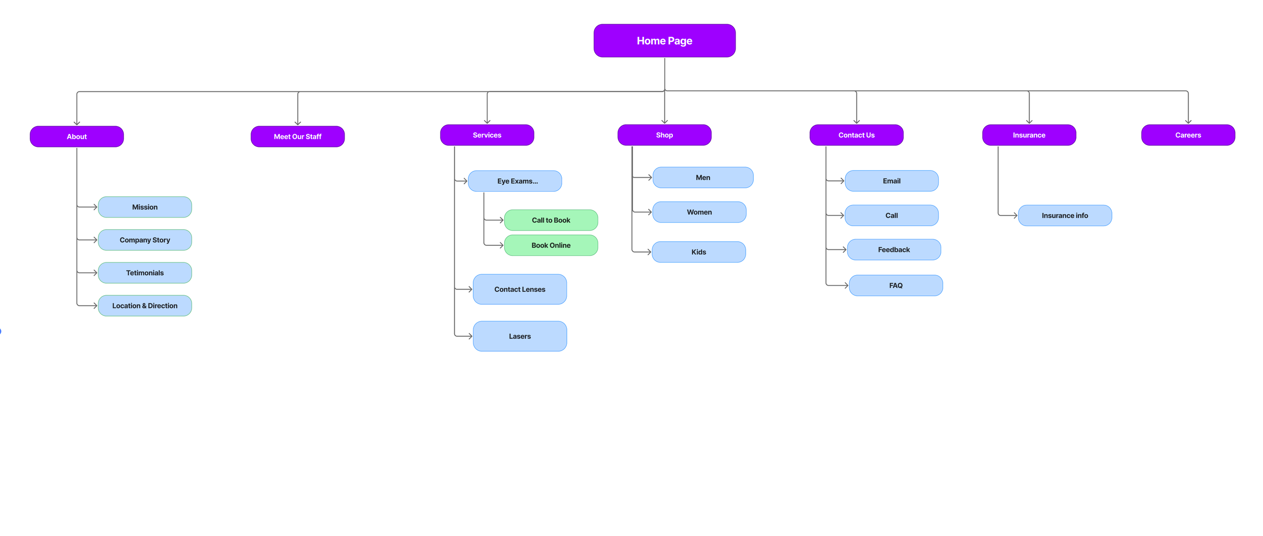
Sitemap
User Flow

My design sketches evolving into digital screens
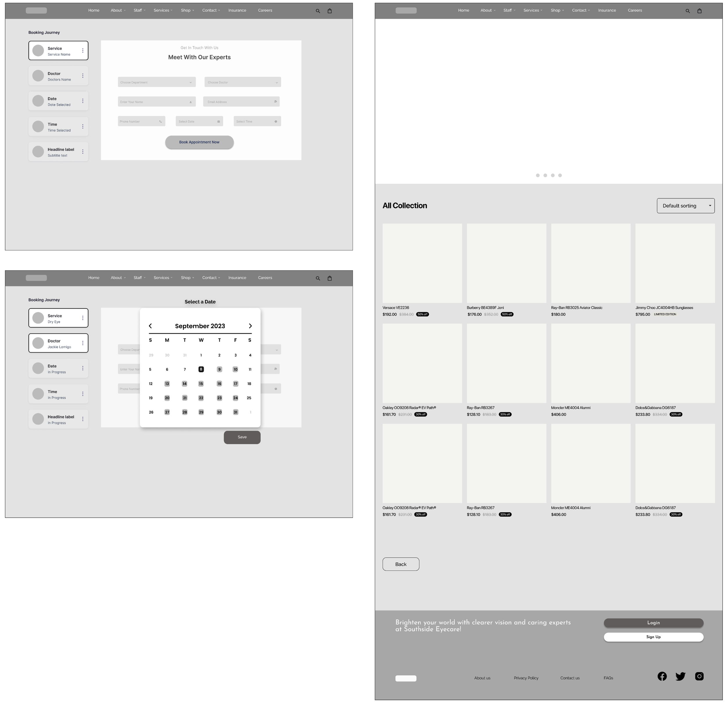
LoFi Wireframes

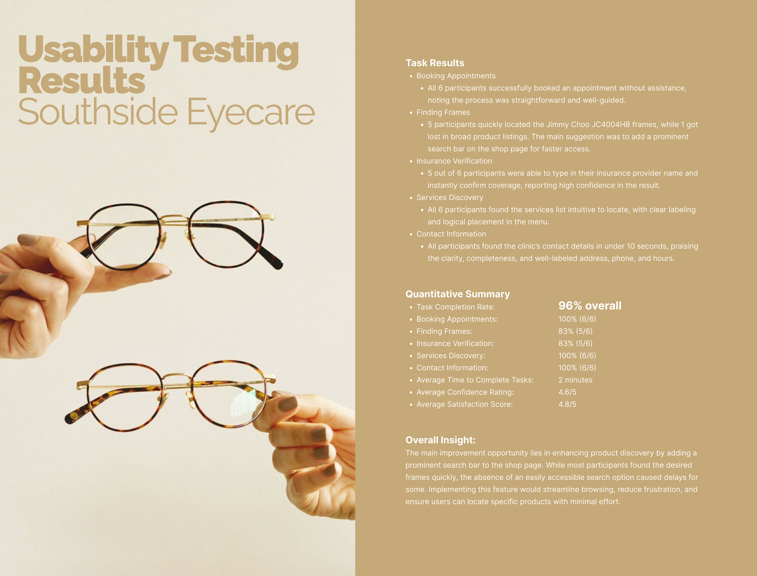
The main focus in this project is interaction design and usability testing, as the original site’s biggest issue was navigation and clarity. Improving these areas had the greatest potential to boost user satisfaction. Early iterations and testing with lo-fi wireframes will validate my design decisions and save time by preventing issues in the high-fidelity design stage.
Iterations
-
Observed Behavior:
4 participants were confused by the breadcrumb navigation displayed right next of the form.
Users expected the breadcrumbs to represent the exact steps they were taking during the appointment process.
Solutions
Re-map Breadcrumb Structure to Match Actual User Flow:
Relabel or Reorganize Input Fields to Match the Breadcrumb Flow
HiFi Wireframes
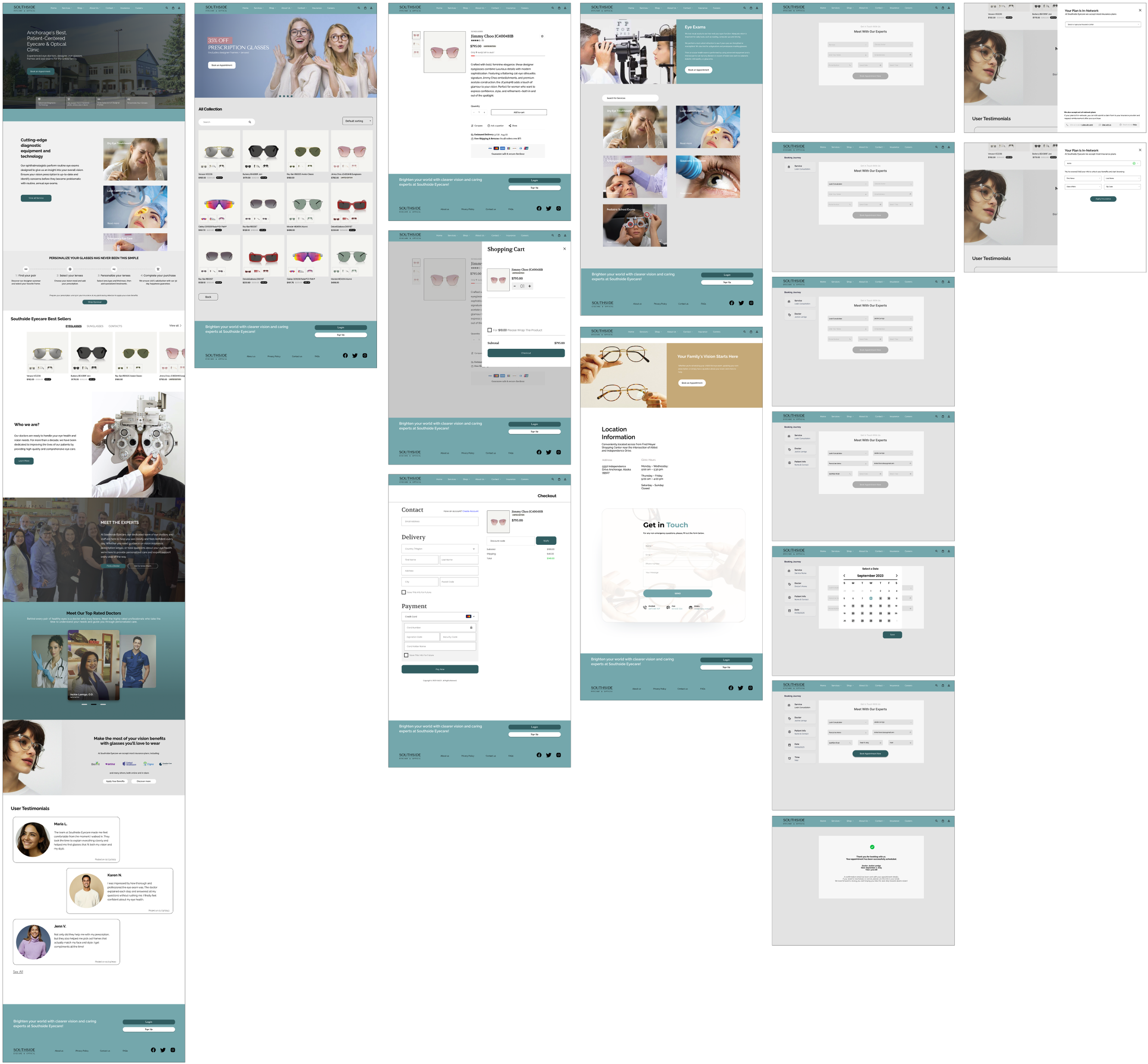
During research, I learned that users place high value on being able to access all essential information such as contact details, insurance coverage, operating hours, and services quickly and without unnecessary clicks. They prefer websites where everything feels within reach from the moment they land on the homepage. Another strong insight was that modern, clean, and up-to-date designs significantly influence trust. Participants mentioned that outdated layouts and visuals made them question the credibility and professionalism of the clinic, whereas a fresh, organized design helped convey reliability and care.
Validating My Design Decisions
User testing should validate not just aesthetics but also content structure.
Clear, concise copy is as important as good visuals.
Small usability improvements (like better search behavior) can significantly improve the overall experience.