
Auto Decline Filter Feature
A feature that streamlines order management, giving Dashers more control on the road.

Why Adding this Feature is Essential?
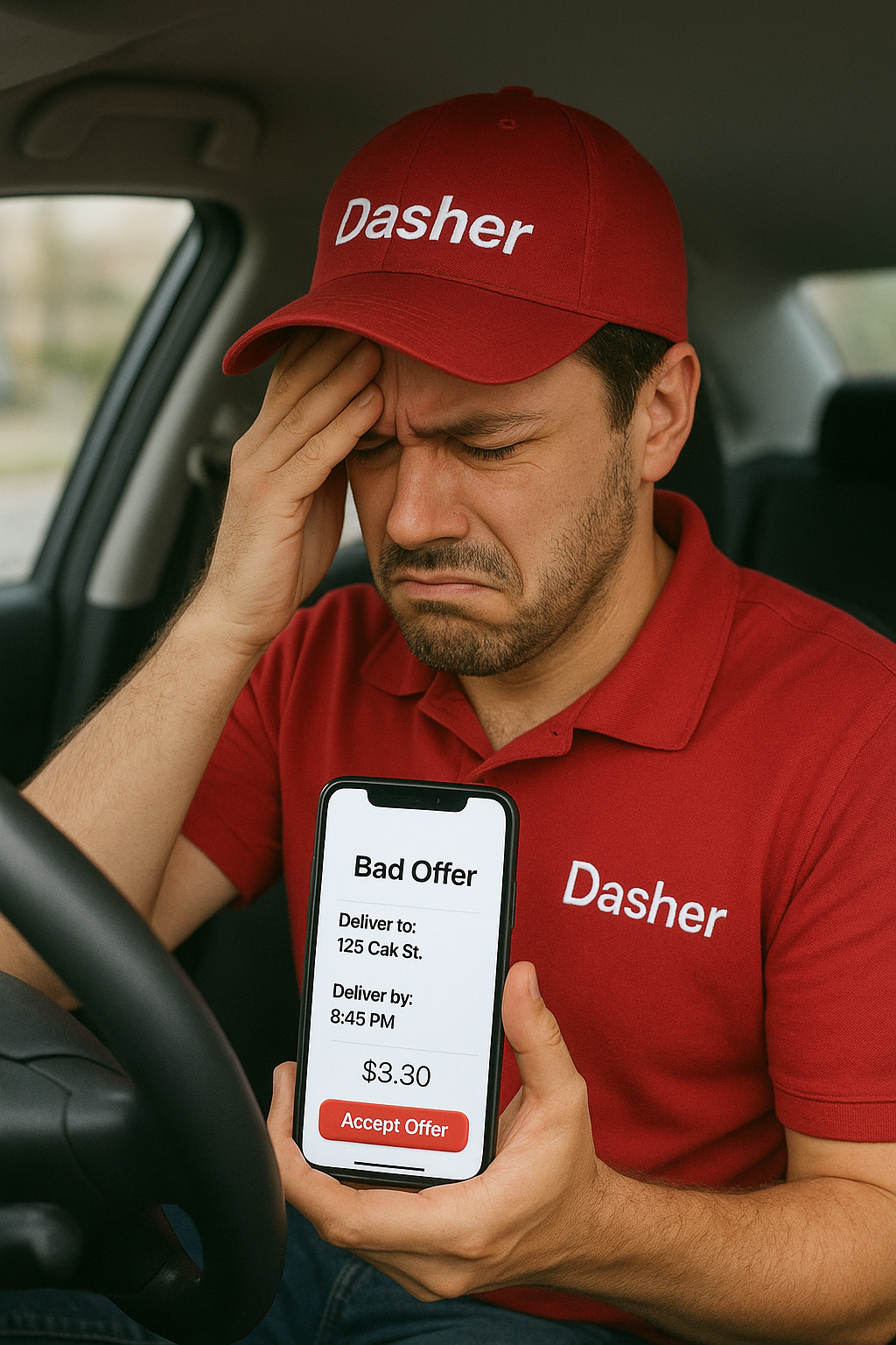
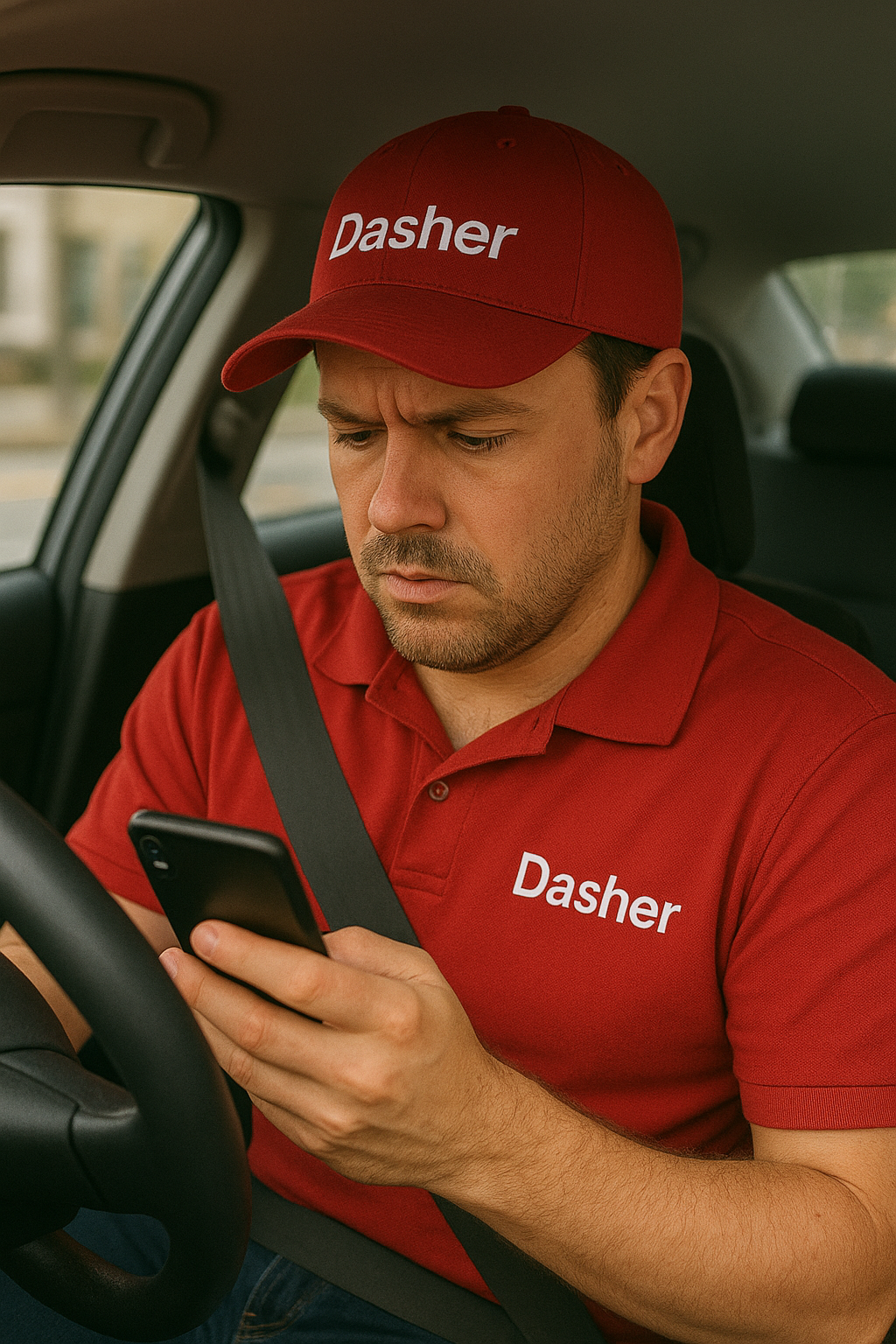
As the gig economy grows, platforms like DoorDash have become essential sources of income for millions of delivery drivers—known as Dashers. While the app provides flexibility and accessibility, it also presents daily challenges. One recurring issue Dashers face is the flood of incoming delivery requests, many of which offer low pay, require excessive travel distances, or involve restaurants with long wait times or poor service experiences. Manually reviewing and declining each of these orders takes time, causes unnecessary distractions, and leads to decision fatigue.
The Auto Decline Filter feature for the DoorDash Dasher app allows delivery drivers to automatically reject orders that don't meet their predefined criteria. This feature helps Dashers filter out less favorable orders (like low-paying or long-distance ones) without having to manually decline each one. By automating the process, it saves time, reduces decision fatigue, and helps drivers focus on more profitable deliveries.
Individual Project
95+ Hours
Figma, Figjam, Procreate, Photoshop, ChatGPT, and Slack
UX Research, Qualitative Interviews, Visual Design, Wireframing, Prototyping, User Testing
Team
Duration
Tools
Key Skills
Benefits and Challenges
-
Time Savings: Dashers no longer need to waste time reviewing and manually declining orders that don’t meet their criteria.
Reduced Decision Fatigue: Automating order rejections allows Dashers to focus on more important tasks, like driving safely and delivering efficiently.
Improved Earnings Potential: Dashers can filter out unprofitable orders, leading them to accept only the orders that align with their financial goals.
Increased Control: Dashers have full control over their preferences, enabling a personalized experience.
-
Risk of Missing Good Orders: There’s always a risk of declining an order that might turn out to be better than expected, especially when it comes to tips. Dashers need to be aware of this risk.
Adjusting Filters: Some Dashers may start out too restrictive and need guidance on fine-tuning their criteria to balance profitability and order volume.
User Trust: Some Dashers may be hesitant to use an automated feature, so offering detailed onboarding, support, and clear notifications will be important to gain their trust.
Last but not the least, Dasher app has an acceptance Rate Requirement of 90% minimum. If the completion Rate is close to or below 90%, meaning that the dasher could be at risk of account deactivation.

Dasher’s Safety is Our Priority
What’s Lacking on the current Dasher App?
A key finding from the competitive analysis is that no major delivery apps — DoorDash, Uber Eats, Grubhub, Instacart, or Amazon Flex — offer built-in auto-decline filters for drivers. This forces gig workers to make constant, on-the-road decisions about pay, distance, and wait times, creating distractions that impact both efficiency and road safety while contributing to stress and burnout. Introducing customizable filters could reduce decision fatigue, enhance safety, boost satisfaction, and position DoorDash as a driver-first platform by reinforcing autonomy and control.
By listening to real Dashers, assumptions became insights.
To understand how Dashers handle incoming orders, I interviewed active delivery drivers to learn how they make decisions on the road. I explored their workflows, the tools they rely on, and the challenges they face with constant order requests. These conversations revealed key pain points around safety, decision fatigue, and lack of control — highlighting opportunities to make order management smarter, safer, and more driver-friendly.
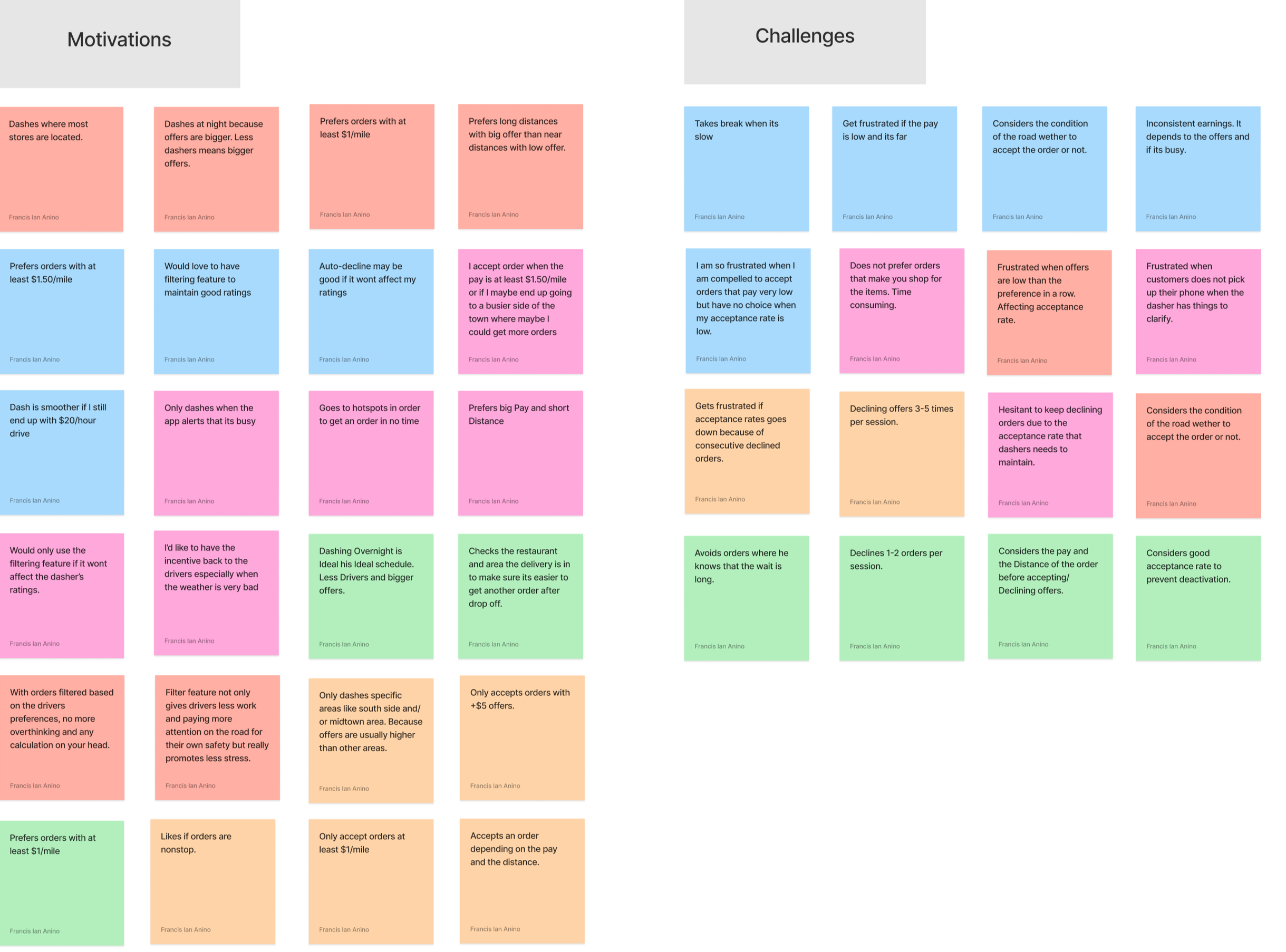
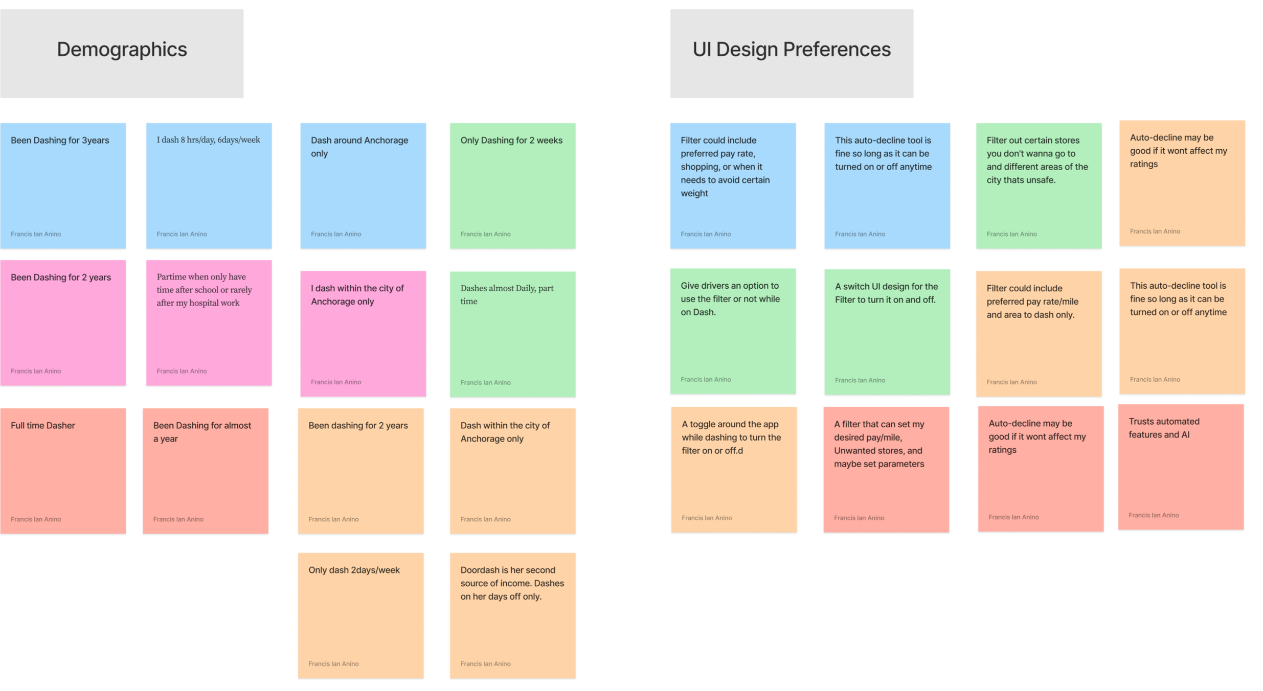
Key Insights from User Interviews
-
![]()
Decision Fatigue
Constantly evaluating pay, distance, and wait times for every order leads to stress and mental strain.
-
![]()
Safety Concerns
Reviewing and declining orders while driving creates distractions that compromise road safety.
-
![]()
Lack of Control
Dashers want more autonomy, but the current app forces them into reactive decision-making instead of proactive planning.
-
![]()
Driver Priorities
Earnings, and restaurant preferences are the top factors influencing order acceptance.
Affinity Mapping
Persona

-
The Dasher
Age: 27
Role: Full-time DoorDasher Driver
Location: Anchorage, Alaska
Experience: 1.5 years
-
Luis left his 9–5 job during the pandemic and has since found flexibility and decent income through Doordash. He prefers dashing because it gives him control over his schedule. However, he often finds himself overwhelmed by the constant decision-making required to sort through unprofitable or inconvenient orders. He wants to work smarter, not harder, and is actively looking for ways to improve his efficiency without compromising earnings.
-
Increase earnings per hour by filtering out low-value orders
Spend less time reviewing and declining offers
Be able to focus more in driving for his safety
Maintain full control over the types of orders he receives
Good acceptance rate
-
Gets bombarded with low-paying orders.
Finds it mentally draining to constantly evaluate each incoming offer or calculating them.
Worries that automation might cause him to miss good opportunities.
Can’t completely focus on the road for their own safety if too busy accepting or declining orders
-
Custom filters based on pay per mile and restaurant preferences
Real-time control (pause, adjust anytime)
Simple, intuitive setup with the ability to opt-in/out easily
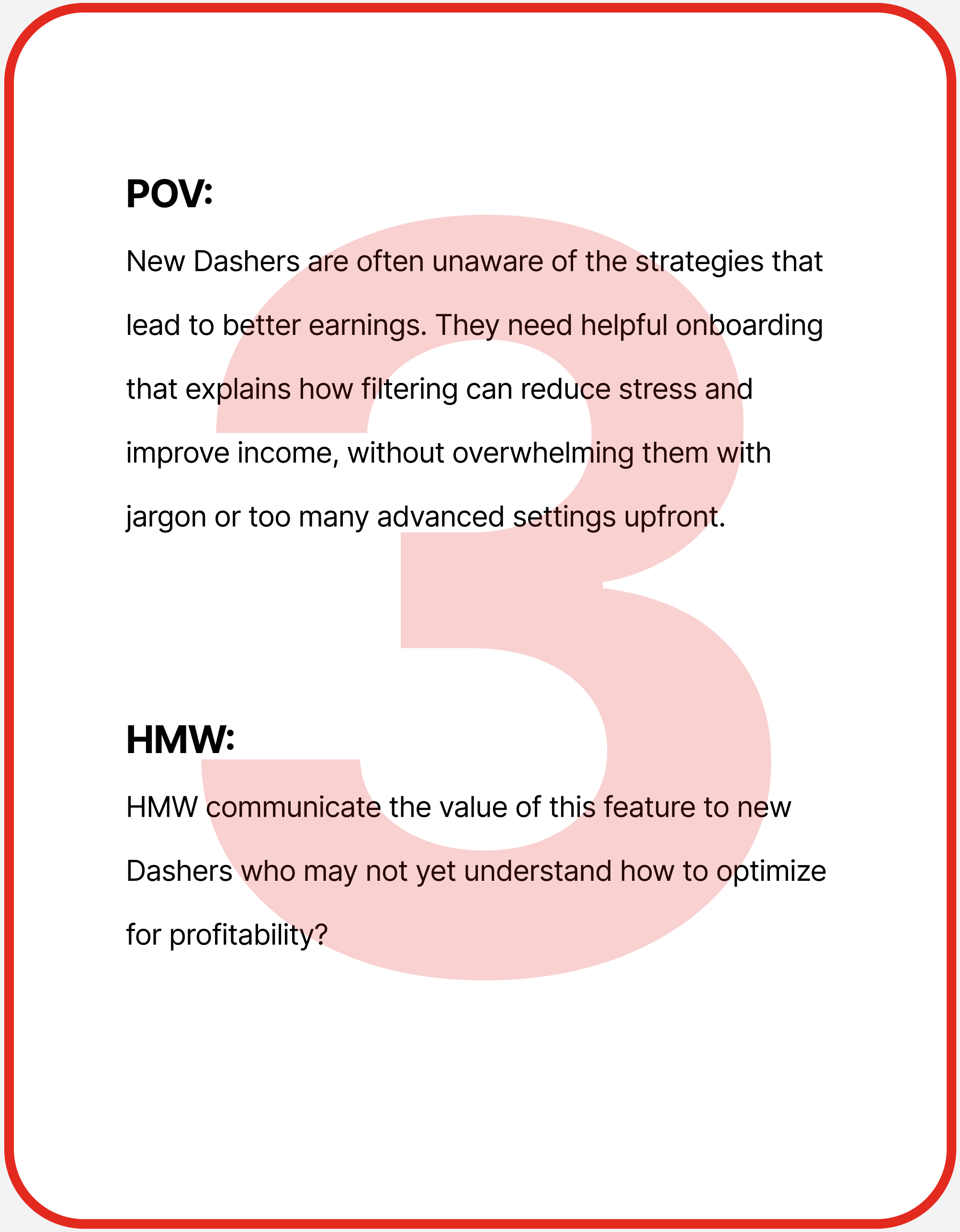
Bridging the Gap between Research and Ideation
POVs and HMWs translate user research into clear problem statements and design opportunities


A simple, customizable tool that filters out undesirable orders, helping Dashers maximize earnings, stay safe on the road, and maintain control over their acceptance rate.
How Can We Help Dashers Solve their problem

Feature Roadmap
The feature roadmap is a crucial step in this project, especially since its core purpose is to introduce a new feature that enhances the Dasher experience. This roadmap organizes potential features into four categories—Must-Have, Nice-to-Have, Surprising & Delightful, and Can Come Later—to clearly prioritize design and development efforts. Each feature is supported by user research and includes a description that explains its value to Dashers. This structured approach ensures the Auto-Decline Filter not only solves the core problem of reducing decision fatigue but also evolves with thoughtful additions that balance usability, control, and user satisfaction over time.
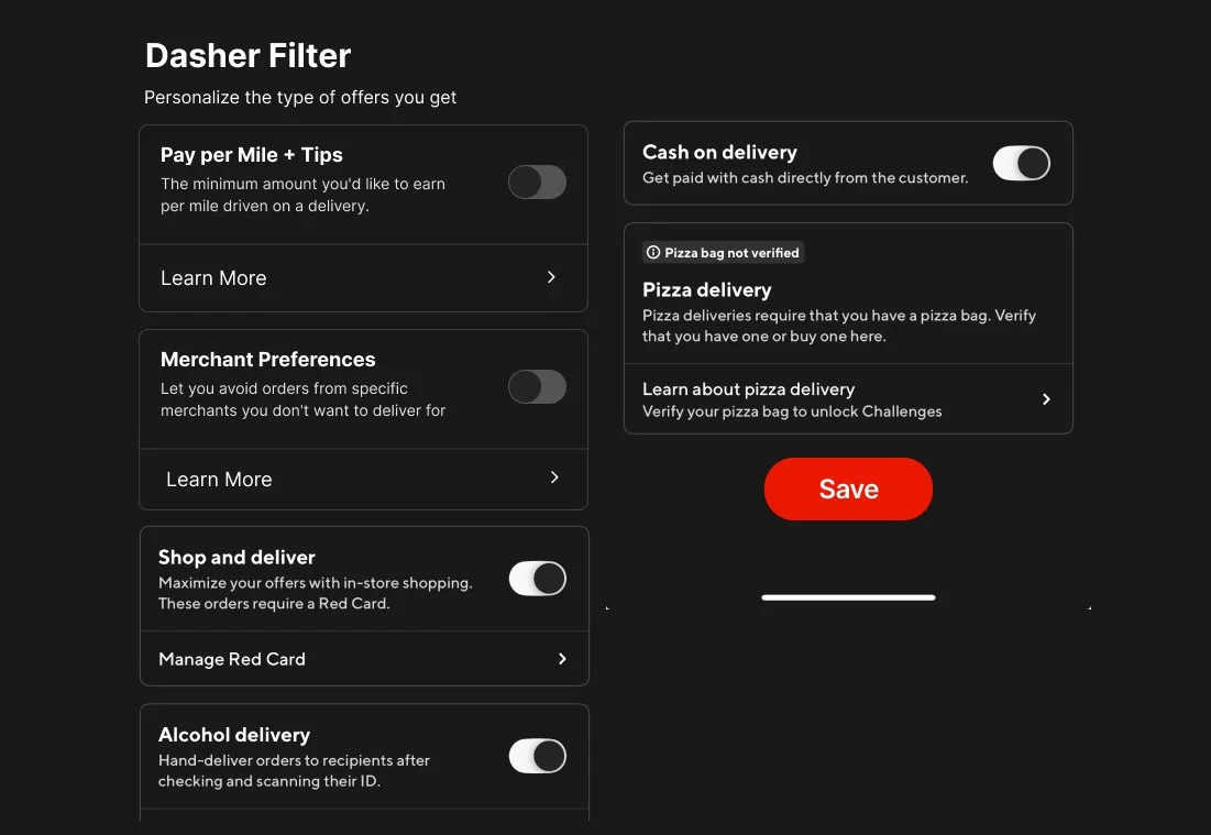
A simple and intuitive switch within the Dasher app that allows drivers to easily turn the Auto Decline Filter feature on or off at any time, giving them full control over when they want the system to handle order filtering and when they prefer to manually review offers.
Auto Decline Toggle Button

Allow Dashers to set personalized thresholds—such as minimum pay per mile, and preferred or blocked merchants—so the Auto Decline Filter only accepts offers that meet their individual criteria and aligns with their earning goals and driving preferences.”
Basic Filtering Criteria

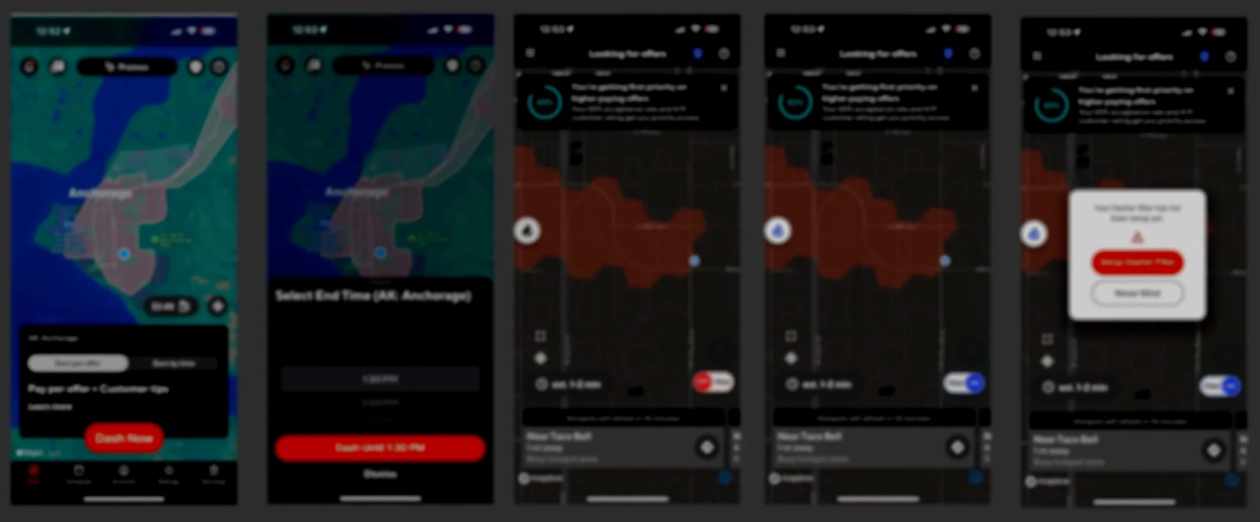
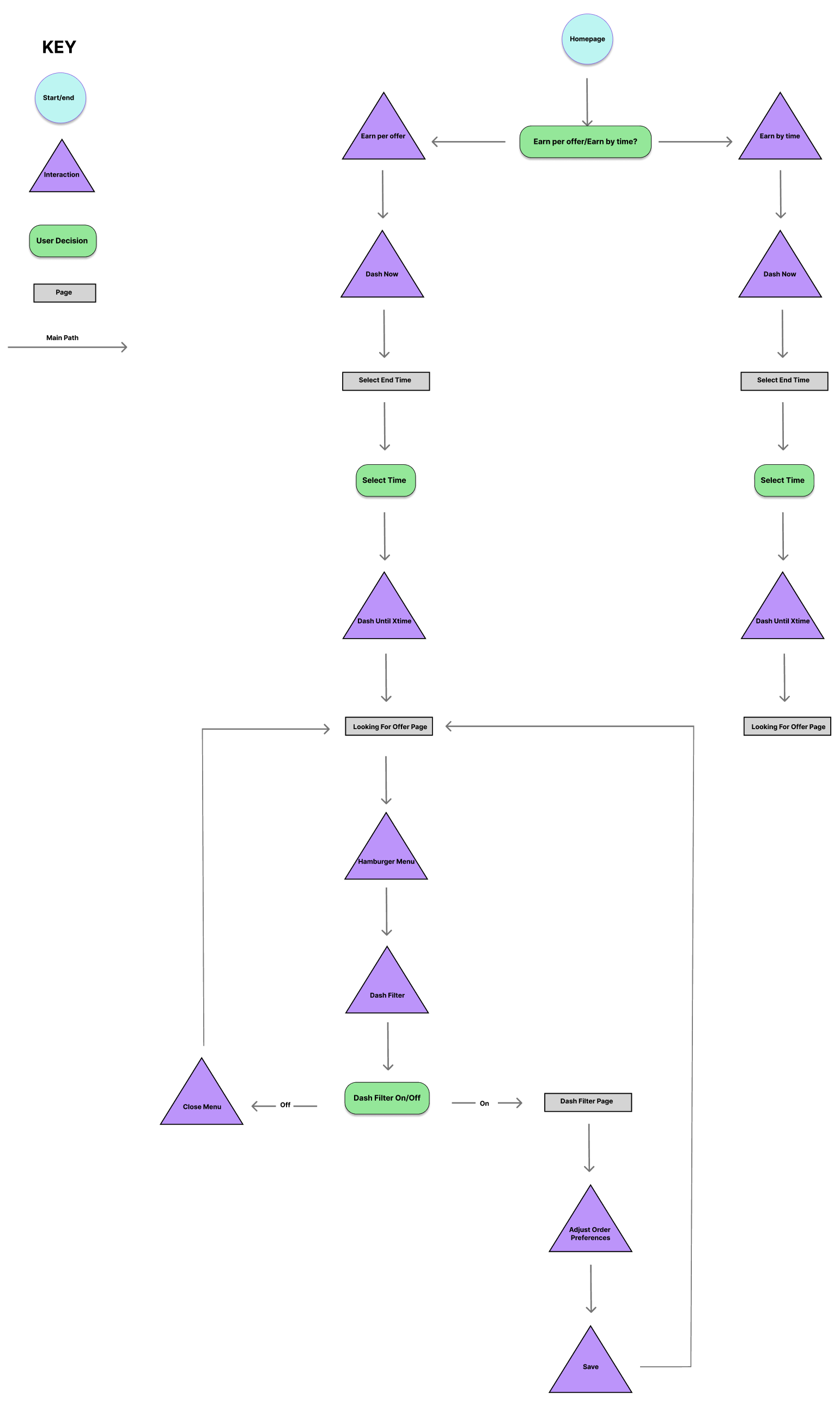
User Flow
A step-by-step map of how Dashers interact with the Auto-Decline Filter feature during their deliveries. The flow was designed with clarity and simplicity in mind, ensuring that even new Dashers can easily learn how to set up and adjust the filter. By focusing on intuitive actions and minimizing friction, the design strengthens learnability and builds user confidence from the very first use.
My design sketches evolving into digital screens

LoFi Wireframes
I began the design process with quick hand sketches, exploring layouts and user flows guided by the sitemap. Refined each screen through user feedback and testing. This iterative approach helped uncover issues early, improve interactions, and ensure the Auto-Decline Filter was built on a strong, user-centered foundation before moving into high-fidelity design.

MidFi Wireframes

Since the branding and visual language were already established, this step was relatively quick—I followed the current UI design patterns to ensure consistency. These wireframes demonstrate how the new feature fits seamlessly within the familiar look and feel of the app, preserving usability while introducing new functionality.
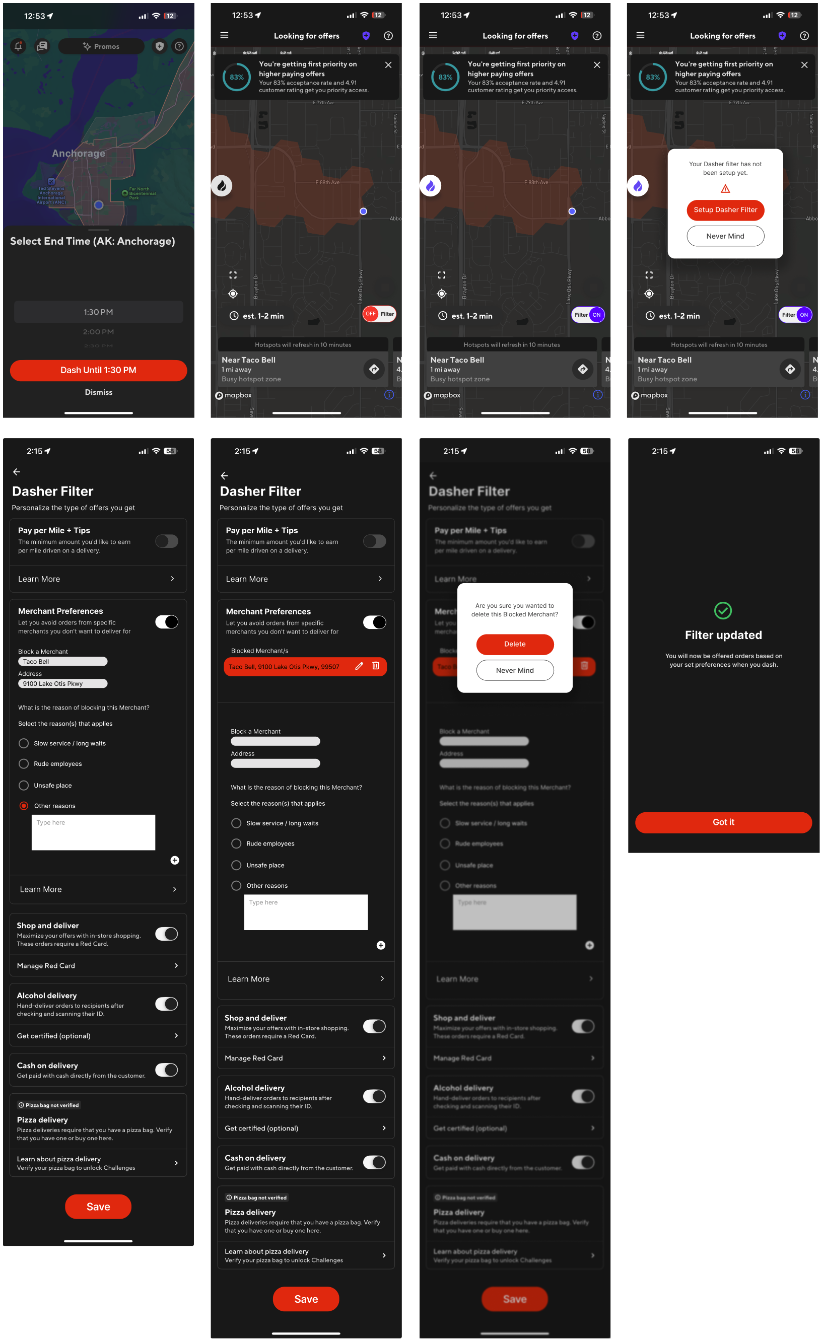
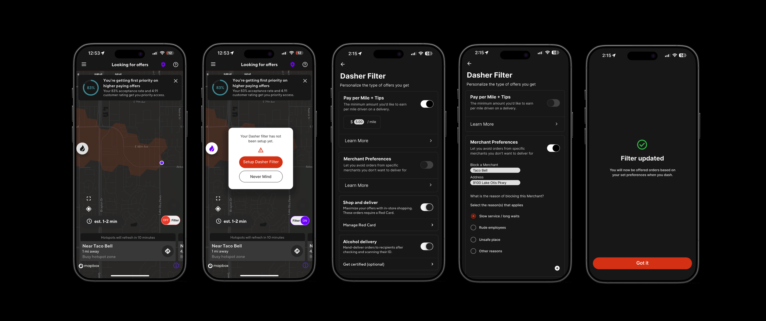
HiFi Wireframes
The high-fidelity wireframes bring the Auto-Decline Filter to life with polished visuals that mirror the actual DoorDash interface. Building on the mid-fi designs, I refined the spacing, and visual hierarchy to align seamlessly with the app’s design system. This is the design users will interact with during usability testing, shaped through earlier feedback to ensure clarity, ease of use, and a seamless fit within the overall Dasher experience.
Validating My Design Decisions Through Usability Testing
I conducted usability testing with Dashers to evaluate how easily they could locate and use the new Auto Decline Filter features, including Pay Per Mile and Merchant Preferences. The study measured task success, navigation efficiency, and user satisfaction, revealing key insights that guided design refinements to make the feature more intuitive and reliable.
Key Insights from Usability Testing
-

Increased Toggle Filter Switch Size
Increasing the button size and contrast is a crucial improvement for both accessibility and usability. Larger, high-contrast buttons are significantly easier to see and tap, especially for users with visual impairments or motor difficulties. This change also enhances the mobile experience, where smaller screens make precise taps more challenging. By making buttons more prominent and easier to interact with, users can navigate the interface more confidently and efficiently. Visually distinct buttons help users quickly identify the right actions, leading to fewer errors and a smoother, more intuitive interaction overall. -
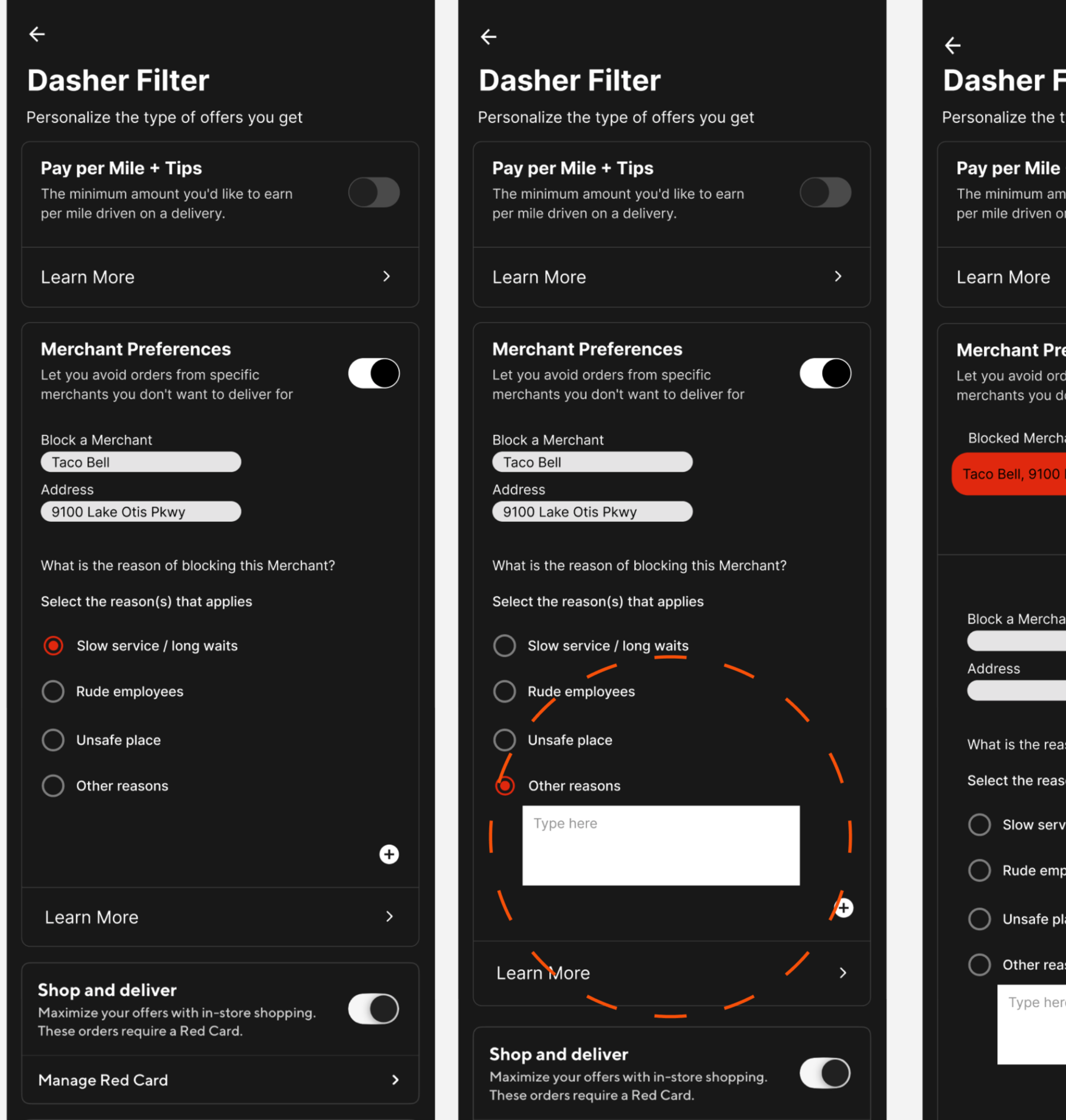
Replace the “Other” Option with a Text Input Field
Replacing the vague “Other” option with a dedicated text input field creates a more personalized and respectful user experience. Users often hesitate when faced with ambiguous choices, but a text input clearly invites them to share specific thoughts or preferences. This not only makes users feel more heard but also results in more meaningful and actionable feedback for the design team. By allowing users to define their own responses instead of selecting from limited choices, this update enhances clarity, boosts engagement, and shows that the system values individual input beyond predefined categories.
-

Allow Review, Edit, or Undo Merchant Blocks
Adding the ability to review, edit, or undo merchant blocks empowers users with greater control over their actions and decisions. People can make mistakes or change their minds, and this feature provides the flexibility to correct or revise choices without penalty. It also builds trust, as users know they are not locked into permanent decisions and can revisit their preferences at any time. By supporting error recovery and adaptability, this change makes the system more forgiving, user-friendly, and aligned with real-life usage patterns.
Final Design & Next Steps
For all my projects, I always ask myself, does it actually work in real-world practice?…
Next Steps
Pilot Testing
Launch the feature with a small group of Dashers in selected markets to measure real-world usage, order acceptance patterns, and satisfaction.
Iterate
Use pilot results to refine filter options, improve clarity in the Learn More sections, and ensure the feature works seamlessly during peak delivery hours.